When I started looking at houses, one thing was clear: location matters. A lot!
But it’s hard to get a feel for a place without actually living there.
Crime stats seemed like a good proxy for quickly finding out what the quality of life is like in an area without having to check every possible metric. Not perfect, but better than nothing.
Websites already exist for this kind of stuff, but I found most suferred from:
- limited data (e.g. showing past 3 months only),
- hard to interpret,
- vague (doesn’t say the crime severity),
- behind a paywall.
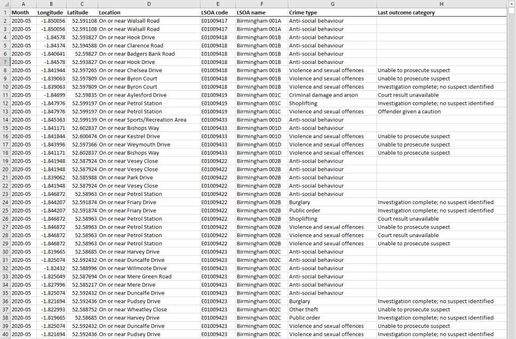
Eventually, I realised the raw data is publicly available anyway on local council and gov websites (in CSV format, with time, place and crime type).
But this data in its raw format is meaningless. So I made a simple tool.
What It Does
You enter a postcode.
It pulls up all reported crimes within 350 metres.
Shows them on a map as a heatmap. That’s it.
It’s quick to get a sense of whether an area is worth shortlisting or skipping.
Here’s a basic preview of what I put together:
How It Works
In short, we need to:
- Convert postcodes into map coordinates.
- Load and filter all the crime data (pandas dataframe).
- Find which crimes are close to the property (Haversine formula to find crimes occurring within a 350-meter radius of a lat/long).
- Visualise the results (folium to create an interactive heatmap, grouping nearby crimes to reduce clutter and adding informative tooltips).
Step 1: Getting Coordinates from a Postcode
First, use Nominatim API (from OpenStreetMap) to convert a postcode into latitude and longitude coordinates.
import requests

def get_lat_lon(postcode):
    url = 'https://nominatim.openstreetmap.org/search'
    params = {
        'q': postcode,
        'format': 'json',
        'addressdetails': 1,
        'countrycodes': 'GB'
    }
    response = requests.get(url, params=params)
    if response.status_code == 200:
        data = response.json()
        if len(data) > 0:
            lat = data[0]['lat']
            lon = data[0]['lon']
            return float(lat), float(lon)
        else:
            return None, None
    else:
        return None, None
Step 2: Loading the Data
Next, pull everything into a pandas DataFrame from the CSV file.
import pandas as pd

all_crime_df = pd.read_csv('combined_crime.csv', usecols=['Month', 'Longitude', 'Latitude', 'Crime type'])
Step 3: Filtering the Data
Now, filter the data to the area we’re interested in. For this, use the Haversine formula to calculate the distance between the postcode and each crime, keeping only those within a 350-meter radius.
(Haversine formula is very overkill for the small radius I’ll be using, but it helps future-proof it in case you ever need to use a much larger radius).
from math import radians, cos, sin, sqrt, atan2

def haversine(lat1, long1, lat2, long2):
    R = 6371000  # Radius of the Earth in meters
    lat1, long1, lat2, long2 = map(radians, [lat1, long1, lat2, long2])
    dlat = lat2 - lat1
    dlong = long1 - long2
    a = sin(dlat / 2)**2 + cos(lat1) * cos(lat2) * sin(dlong / 2)**2
    c = 2 * atan2(sqrt(a), sqrt(1 - a))
    distance = R * c
    return distance

mask = all_crime_df.apply(lambda row: haversine(house_lat, house_long, row['Latitude'], row['Longitude']) <= 350, axis=1)
local_crime_df = all_crime_df[mask].copy()  # Make a copy of the DataFrame
Also group similar crime types to simplify the map and make it more readable:
crime_type_renames = {
    'Anti-social behaviour': 'Anti-social/Public Disorder',
    'Public order': 'Anti-social/Public Disorder',
    'Violence and sexual offences': 'Violence/Sexual/Robbery',
    'Theft from the person': 'Violence/Sexual/Robbery',
    'Robbery': 'Violence/Sexual/Robbery',
    'Burglary': 'Burglary/Vehicle crime',
    'Vehicle crime': 'Burglary/Vehicle crime'
}

local_crime_df['Crime type'] = local_crime_df['Crime type'].replace(crime_type_renames)
Step 4: Plot the Heatmap
Use folium to create an interactive map with a 350-meter radius circle showing our interested area.
import folium
from folium.plugins import HeatMap
from folium.features import DivIcon

m = folium.Map(location=[house_lat, house_long], zoom_start=16)

# Add a circle with a 350m radius to represent the area of interest
folium.Circle(
    location=[house_lat, house_long],
    radius=350,
    color='#3186cc',
    fill=True,
    fill_color='#3186cc'
).add_to(m)

heat_data = [[row['Latitude'], row['Longitude']] for index, row in local_crime_df.iterrows()]
HeatMap(heat_data).add_to(m)
Step 5: Adding Markers and Tooltips
To keep the useful info from the original CSV data, added tooltip markers that show details about the crimes, sorted from most recent to least recent. Also grouped crimes within a 10m distance into the same tooltip to reduce clutter.
# Dictionary to store combined tooltips
combined_tooltips = {}

# Build combined tooltips
for index, row in local_crime_df.iterrows():
    lat, long = row['Latitude'], row['Longitude']
    key = None

    for (ref_lat, ref_long), tooltip in combined_tooltips.items():
        if haversine(lat, long, ref_lat, ref_long) <= 10:
            key = (ref_lat, ref_long)
            break

    if key:
        combined_tooltips[key].append((row['Month'], row['Crime type']))
    else:
        combined_tooltips[(lat, long)] = [(row['Month'], row['Crime type'])]

# Add markers with combined tooltips to the map
for (lat, long), tooltips in combined_tooltips.items():
    tooltip_text = '<div style="font-size: 12px; font-weight: 500;">' + '<br>'.join([f"{month} - {crime}" for month, crime in sorted(tooltips, reverse=True)]) + '</div>'
    folium.Marker(
        location=[lat, long],
        tooltip=tooltip_text,
        icon=folium.Icon(color='white', icon_color='black', icon='info-sign', icon_anchor=(15, 30)),
        opacity=0,
        fill_opacity=0,
        icon_opacity=0
    ).add_to(m)
Step 5: Final Touches and Saving the Map
Also added a small cross to mark the approximate house location (centre of the postcode) and label the 350-meter radius. Then saved the map as a HTML file.
# Adding a small cross at the house_lat, house_long position
cross_icon = DivIcon(icon_size=(20, 20), icon_anchor=(10, 10), html='<div style="font-size: 40px; color:#d35400;">+</div>')
folium.Marker([house_lat, house_long], icon=cross_icon).add_to(m)

# Adding a "350m radius" label
label_lat = house_lat + (325 / 111111)  # roughly convert 20px to degrees
folium.Marker(
    location=[label_lat, house_long],
    icon=DivIcon(
        icon_size=(150, 36),
        icon_anchor=(20, 0),
        html='<div style="font-size: 16px; font-weight: 800; font-family: Calibri;">350m radius</div>',
    )
).add_to(m)

# Save the map as an HTML file
m.save("crime_heatmap.html")
Result
This has made things much easier. We can quickly narrow down areas without wasting time.
It’s nothing fancy and far from perfect (data doesn’t tell you everything), but it does give a good starting point.
Extras
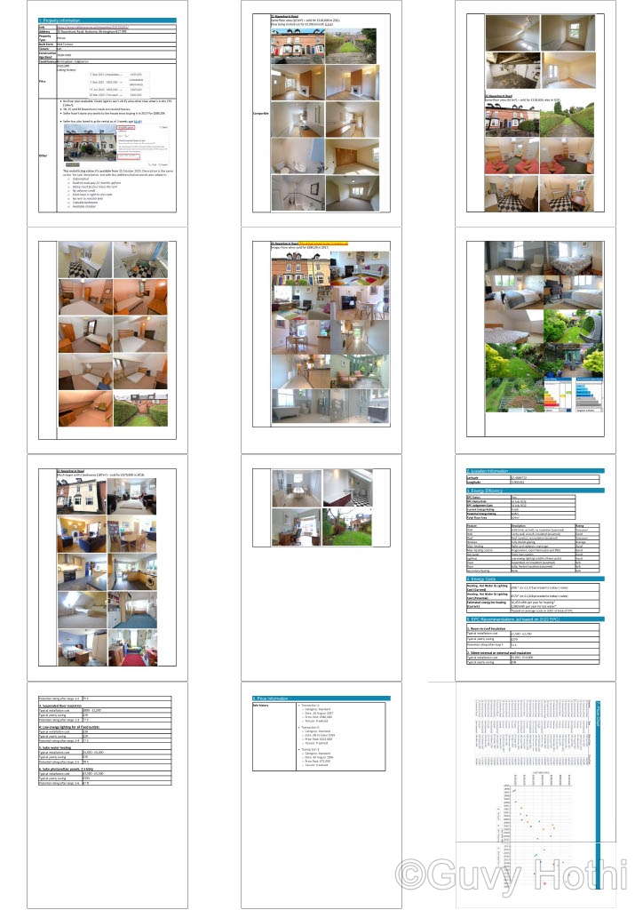
I ended up expanding this into a fully automated house-audit tool to give me as much insight into a house short of actually going to visit it. It pulls:
- Property details (type, form, construction age band, tenure)
- Price listing history
- Past sold prices
- Comparables of other houses that sold on the same road
- Current EPC (and potential costs of upgrading the EPC rating)
- Predicted energy costs for heating, lighting and hot water
- Trend graph of house prices in the area, from 1995 to present date
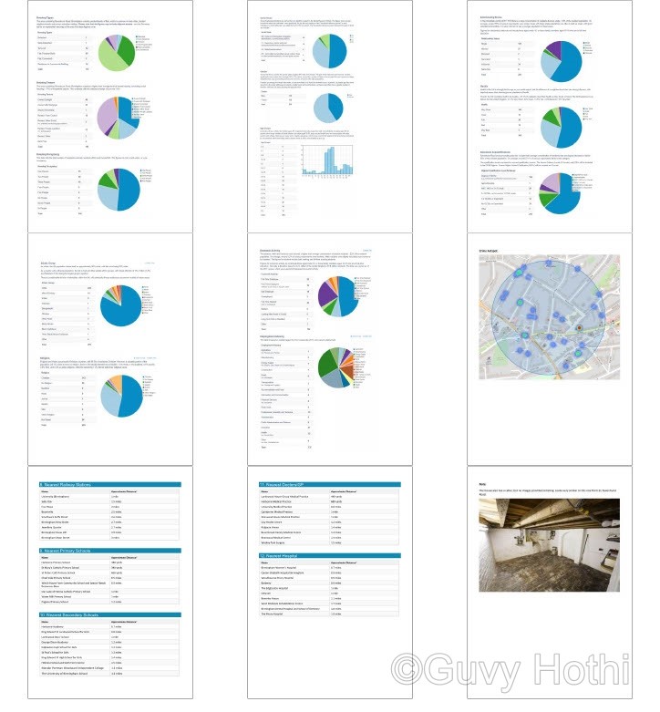
- Charts for the local area, including house types, tenure, occupancy, social grade, gender, age groups, relationship status, health status, education & qualifications, ethnicity, economic activity, employment industry, local crime map (the part we built in this post), nearest train station and schools etc.
It outputs a full PDF report in about 5 seconds – all from a single house address. It only costs about £0.001 per report using API calls, which is so much cheaper than using those other services that provide the same thing for ~£50 report.
Here’s a preview of the output: