I’ve mostly toyed with supervised machine learning in the past due to its much larger utility compared to unsupervised learning. But, this has left me knowing very little about unsupervised machine learning. Although it has lower utility, I still want to know how it can be used practically, especially for clustering unlabelled data.
This is just a documentation of what I learned about it for future reference.
To make this as relevant to me as possible, I wanted to perform unsupervised clustering on industry-specific data. Although many public datasets are available, I decided to create my own synthetic dataset on tunnel boring machine (TBM) performance.

While this means that the conclusions made from this exercise will be completely fictional and useless, my intention was to learn the process and get a feel for the type of insights that can be extracted from unsupervised learning. In other words, I won’t be making any real-life decisions based on the extracted insights, so their validity is a secondary concern.
What is Unsupervised Machine Learning?
In supervised learning, we train models on labelled data. In unsupervised learning, we deal with unlabeled data.
It tries to find patterns or structures in data without being told what to look for. Clustering is one type of unsupervised learning that groups similar data points together based on their features.
Workflow
1. Import Libraries
First, I imported the necessary libraries:
import numpy as np
import pandas as pd
import matplotlib.pyplot as plt
import seaborn as sns
from sklearn.cluster import KMeans
from sklearn.metrics import silhouette_score
from itertools import combinations
What do each of the libraries do?
- numpy: used for converting data to arrays, which we’ll want to do when working with unsupervised ML libaries as they’re a more efficient data form for them to work with.
- pandas: used to import csv data into our project as a DataFrame, and manipulate it as needed.
- matplotlib + seaborn: used for creating visualisations, such as the cluster plots.
- sklearn.cluster: from the scikit-learn library used for clustering. Contains various algos for clustering, including the popular KMeans, which we’ll be using.
- sklearn.metrics: to access the ‘silhouette score’ metric that helps us determine the optimal number of clusters to use.
- itertools: to access functions that help us automatically undertake clustering on different combinations of features, saving us from manually creating a lot of combinations manually ourselves.
2. Read the Data into a Dataframe
data = pd.read_csv('C:/Users/guvyh/Desktop/Jupyter Lab/Cluster Learning/synthetic_TBM_performance_data.csv')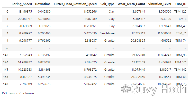
Note: This is a synthetic dataset that I made for the purposes of this example. The data is completely factual and just meant to be an example relevant to my industry. In reality, you’d have to go through the whole data engineering process (collecting, storing, cleaning etc.) to get to this stage, but as this is a synthetic dataset for self-learning purposes, I’ve essentially side-stepped all that by just generating a clean and complete dataset as my starting point.
3. Check the Data
We can get a summary of the data with:
data.info()
This summary is helpful because it helps us understand the structure of the data, e.g. how many columns and rows it has, and what type of data each column contains (e.g., integers, floats, strings). It also lets us quickly double-check if there’s any non-null entries (missing values) in your data set, which you’ll need to address (either by removing those observations from the data set or using a different (and normally more complex) algo to KMeans that can account for missing data).
4. Prepare for Clustering
The next step is to determine how many ‘clusters’ we want. Getting this right is important as it affects the quality and usefulness of the results.
- Too few = oversimplified (broad groupings that miss important patterns)
- Too many = complex (‘forced’ divisions that complicate interpretation)
Elbow Method
From the information I have read, the ‘elbow’ method is the most common way of determining the number of clusters to use due to how intuitive it is.
In short, you pick a range of clusters (k), say 2-10, and for each cluster you calculate the ‘Within-Cluster Sum of Square Errors’ (WCSSE), and plot the results on a chart.
The WCSSE is a measure of how well the data points fit into their assigned clusters. I’ve oversimplified it, but it’s essentially the average distance of all points in a cluster to the cluster’s centroid. The smaller the value, the better the clustering.
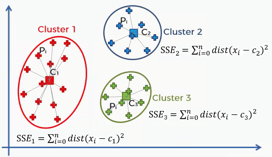
By calculating the WCSSE for a range of cluster numbers (k) and plotting this information, we can find the most optimal number of clusters by finding the ‘elbow’ in the plot. The ‘elbow’ is the point in the plot beyond which additional clusters don’t significantly reduce the WCSSE.
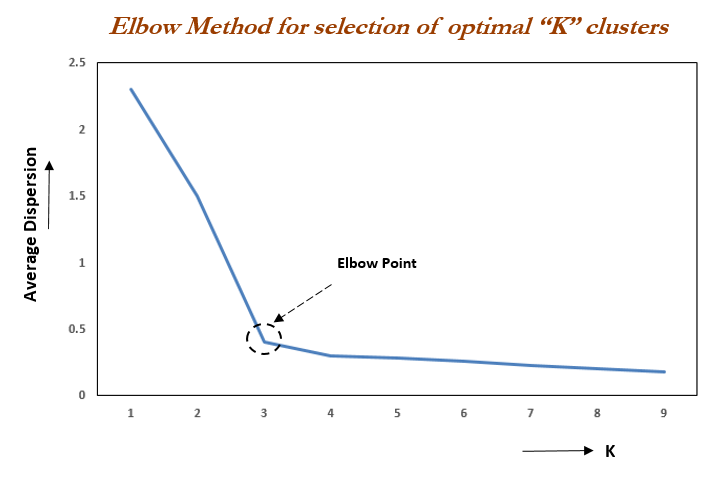
In the above image, the optimum number of clusters would by 4.
Silhouette Method
Another method is the ‘Silhouette method’. This method is a bit more ‘automatic’ in that it doesn’t require us to manually interpret a plot and make an inference for ourselves, but rather returns the optimal number of clusters itself.
Here, we calculate the average silhouette score for a different number of clusters. Similar to the elbow method, the silhouette score measures how well data points fit into their assigned cluster. However, whereas the elbow method measures the ‘within-cluster sum of squared errors’, which indicates how poorly a data point fits its cluster (and so the smaller the WCSSE value, the better), the silhouette scores are a measure of how well the data point fits its cluster compared to the next closest cluster (and so the larger the value, the better – with the number ranging between -1 and 1).
The above video does a much better job of explaining it, but in short, for each number of clusters, the silhouette score is calculated by doing the following for each data point:
a) calculate the average distance to all other points in its cluster (a measure of its cohesion)
b) calculate the average distance to all other points in the nearest cluster (a measure of its separation).
The silhouette score is then calculated as (b – a) / max(a, b).
With this in mind, the function to calculate the silhouette score looks something like:
def calculate_silhouette_scores(X, max_clusters=10):
    silhouette_scores = []
    for n_clusters in range(2, max_clusters + 1):
        kmeans = KMeans(n_clusters=n_clusters, init='k-means++', random_state=0)
        cluster_labels = kmeans.fit_predict(X)
        silhouette_avg = silhouette_score(X, cluster_labels)
        silhouette_scores.append(silhouette_avg)
    return silhouette_scores
Here, we’ve set the maximum number of clusters to 10 and the minimum to 2 (as we can’t really have just one cluster). We also need to specify what initialisation method we want to use for the clustering algorithm.
From what I understand, there’s a handful of algorithms available, but k-means++ is by far the most common used as it typically produces the best clusters due to the unique way in which it selects its starting positions for the initial clusters. In short, rather than selecting random starting points like many of the other algorithms do, k-means++ selects centroids that are likely to be well-spread and so are more likely to form distinct clusters that converge faster.
The code block calculates the silhouette score for each number of clusters and adds them to a list. The function then returns this list once it has looped through all 2-10 clusters.
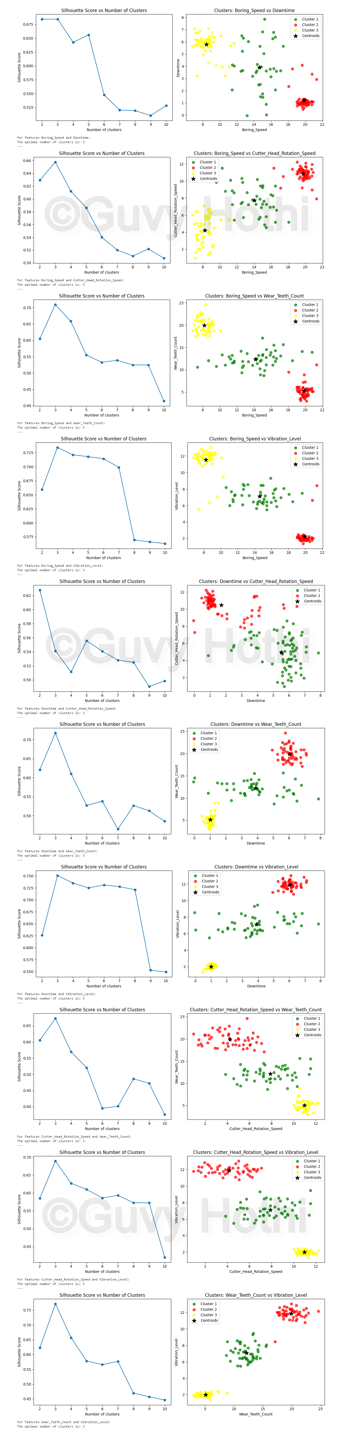
Next, we need a function that uses this silhouette function to perform the clustering process for the ideal number of clusters and plot the results:
def perform_clustering(X, feature_names):
    silhouette_scores = calculate_silhouette_scores(X)
    optimal_clusters = silhouette_scores.index(max(silhouette_scores)) + 2

    kmeans = KMeans(n_clusters=optimal_clusters, init='k-means++', random_state=0)
    Y = kmeans.fit_predict(X)

    plt.figure(figsize=(12, 5))

    # Silhouette score plot
    plt.subplot(1, 2, 1)
    plt.plot(range(2, len(silhouette_scores) + 2), silhouette_scores, marker='o')
    plt.title('Silhouette Score vs Number of Clusters')
    plt.xlabel('Number of clusters')
    plt.ylabel('Silhouette Score')

    # Cluster plot
    plt.subplot(1, 2, 2)
    colors = ['green', 'red', 'yellow', 'violet', 'blue', 'orange', 'purple', 'brown', 'pink', 'gray']
    for i in range(optimal_clusters):
        plt.scatter(X[Y == i, 0], X[Y == i, 1], s=50, c=colors[i], label=f'Cluster {i+1}', alpha=0.7)
    plt.scatter(kmeans.cluster_centers_[:,0], kmeans.cluster_centers_[:,1], s=150, c='black', label='Centroids', marker='*')
    plt.title(f'Clusters: {feature_names[0]} vs {feature_names[1]}')
    plt.xlabel(feature_names[0])
    plt.ylabel(feature_names[1])
    plt.legend()

    plt.tight_layout()
    plt.show()

    print(f"For features {feature_names[0]} and {feature_names[1]}:")
    print(f"The optimal number of clusters is: {optimal_clusters}")
    print("---")
This function does that. It:
- calls calculate_silhouette_scores() to get silhouette scores for different numbers of clusters.
- finds the optimal number of clusters (the one with the highest silhouette score).
- performs KMeans clustering with the optimal number of clusters.
- creates two plots:
- A plot of silhouette scores vs. number of clusters
- A scatter plot of the data points, coloured by cluster
- prints the optimal number of clusters.
5. Perform Clustering
Now we can create a for loop to run the clustering analysis on every possible pair of numerical-based features in our dataset:
# Get numerical columns (int64 or float64)
numeric_columns = data.select_dtypes(include=['int64', 'float64']).columns

# Perform clustering for each combination of features
for feature_combo in combinations(numeric_columns, 2):
    # Clean data for the current feature combination
    current_data = data[list(feature_combo)].dropna()

    if len(current_data) > 0:  # Ensure we have data after dropping NA
        X = current_data.values
        perform_clustering(X, feature_combo)
This works by:
- selecting all numerical-based columns from the DataFrame (remember the data.info() function we used earlier?.. This is where its output comes in useful)
- it then loops through all possible pairs of these numeric columns.
- for each pair, it:
- selects the data for those two features
- removes any rows with missing values
- if there’s any data left, it performs clustering on it
Results
The clustering analysis produces several plots:
Observations
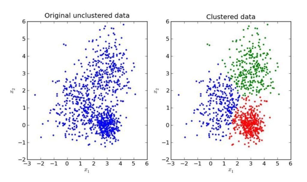
One interesting plot is as follows:
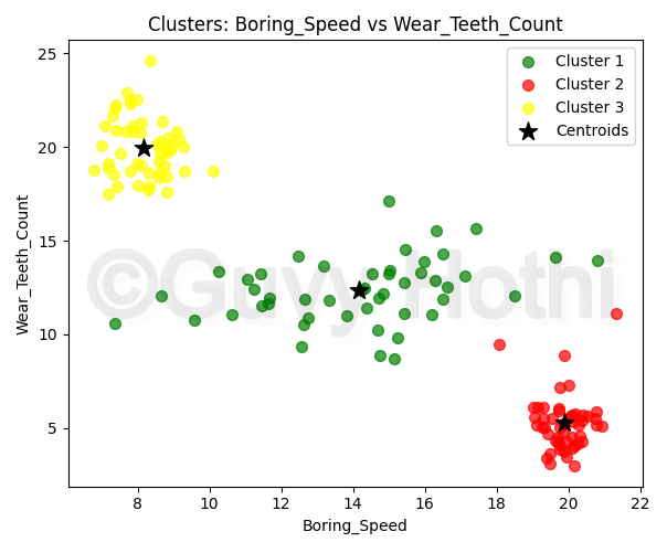
It essentially shows three distinct clusters:
- A cluster with high speed and low wear
- A cluster with low speed and high wear
- A cluster with consistent wear across different speeds
These clusters suggest different performance patterns among the TBMs in the dataset. Two things immediately jump out:
1. Contrasting Wear Patterns:
The most obvious observation is the contrast between the red cluster (high speed, low wear) and the yellow cluster (low speed, high wear). This warrants further investigation to determine what allows the red cluster TBMs to achieve higher speeds with less wear.
Understanding this could potentially lead to improvements in TBM design or operational strategies for difficult conditions.
For example, this further analysis could look at the specific conditions associated with each of these clusters, including things like:
- TBM design specifications
- Operational parameters (thrust, torque, RPM)
- Cutting tool materials and designs
2. Consistency in Green Cluster:
The green cluster shows relatively consistent wear across a wide range of boring speeds, which is interesting.
If we investigate TBM characteristics associated with this cluster to determine what factors contribute to this consistent wear pattern, we could try to determine if there’s any specific operational practices or TBM designs that enable this stability. This information could then potentially be applied to future TBM designs or selections to improve long-term performance.
These could be factors like:
- The maintenance schedule for these TBMs
- The specific materials used in their construction
- The expertise of the operators
Note: Remember that this is a synthetic dataset that I created in carrying out this self-learning exercise. The findings are therefore entirely factual. The point being made here isn’t about the validity of the insights themselves, but to highlight the type of insight unsupervised clustered learning can provide. This type of insight may otherwise have gone unnoticed because it’s difficult to spot patterns that you’re not looking for in raw datasets, such as those in typical tabular format (e.g. excel spreadsheets).
TL;DR
This exercise was really about learning how unsupervised learning can find patterns in data that might otherwise be well hidden. Although this example used synthetic data, the process could easily be applied to real-world data in the civil engineering and construction industry, whether to potentially improve the operation of TBMs or to gain insight into the deterioration of an asset owner’s structures.
In the real world, you’d also need to carry out data engineering (data collection, cleaning and storage) at the start of this pipeline and, towards the end of the pipeline, validate any clusters with domain experts and investigate the factors that might be causing them or contributing to their characteristics.